Infographic design
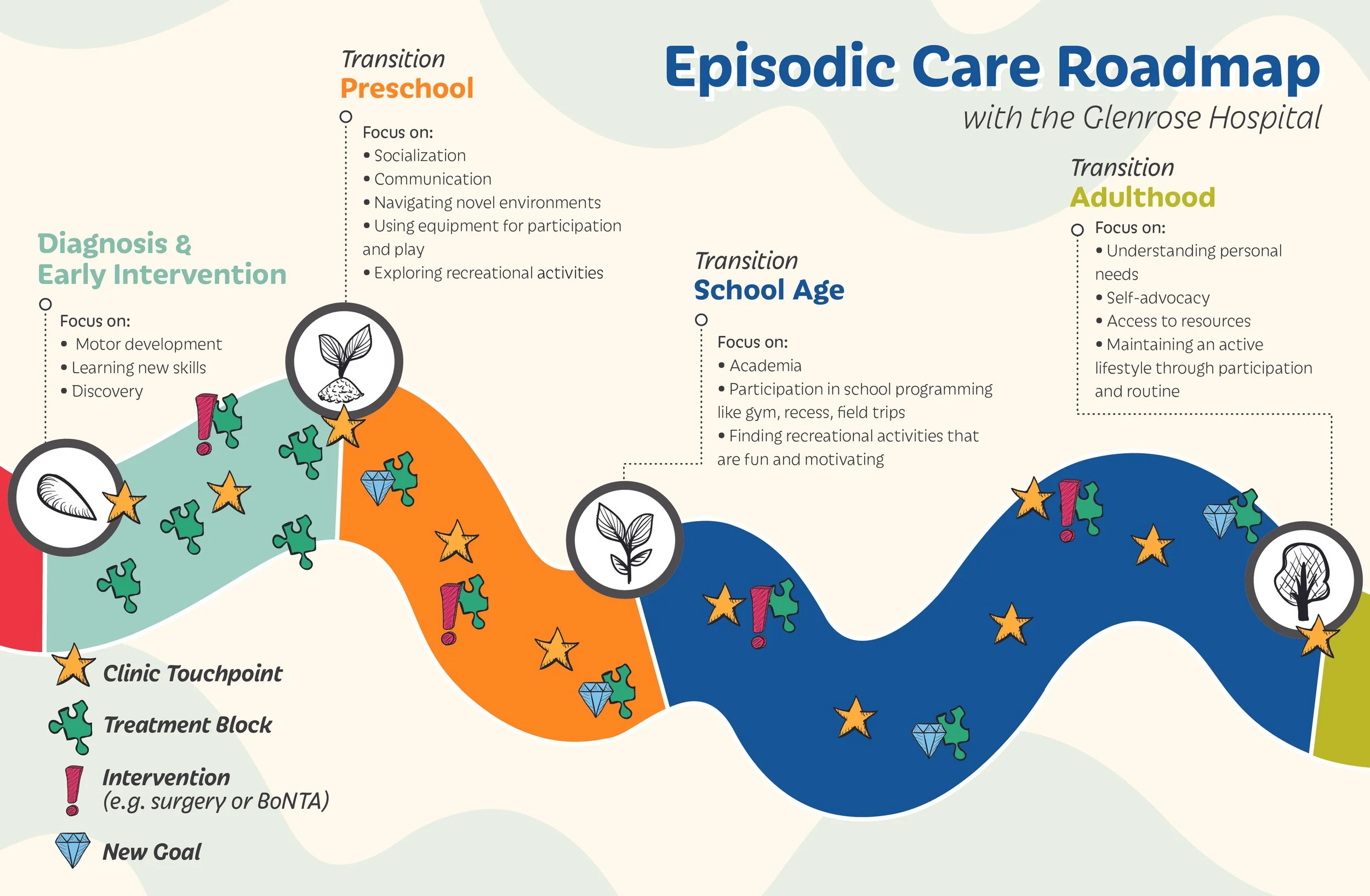
GLENROSE REHABILITATION HOSPITAL | EPISODIC CARE MAP DESIGN
Developed with a team of pediatric physiotherapists to help their patients’ families ghave a better understanding of their child’s course of care, milestones, and expected outcomes.
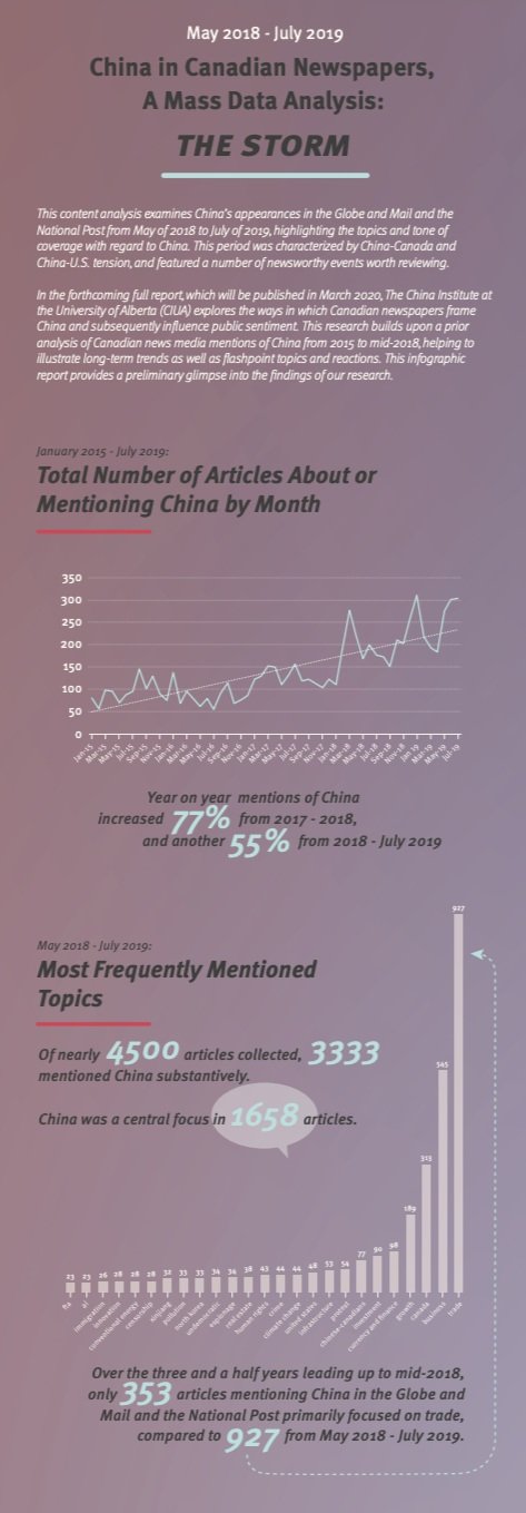
MASS DATA ANALYSIS | INFOGRAPHIC
This content analysis examines China’s appearances in the Globe and Mail and the National Post from May of 2018 to July of 2019, highlighting the topics and tone of coverage with regard to China. This period was characterized by China-Canada and China-U.S. tension, and featured a number of newsworthy events worth reviewing.
Designed for the China Institute at the University of Alberta.


CHINA TRADE | DATA VISUALIZATION
Data visualization of China's trade with the US and Canada presenting the key figures of US-China and Canada-China bilateral international trade in 2018.
Designed for the China Institute at the University of Alberta.
CHINA NUMBERS | DATA VISUALIZATION
Data visualization presenting three key areas of China’s growth: GDP, population, and the size of large Chinese enterprises. Infographic maps comparing Chinese numbers (GDP, population, etc.) with the rest of the world. This data visualization was created as a feature on the China Institute website, to display interesting comparisons in a visually appealing and exciting manner. Numbers and data provided by researchers. Total project included five infographics.
Designed for the China Institute at the University of Alberta.
PORTOGRUARO | MAP
Map illustrating the bike ride into the town of Portogruaro from my family home in the countryside.


NICA, LATVIA | INFOGRAPHIC
Northern Cities illustrated infographic on the city of Nica, Latvia, and its tradition of “stranded” knitted mittens.